Printing poetry at Otago
Twenty years ago, I visited Dunedin for a couple of days on a NZ touring holiday and loved it at first sight. I always hoped to get back here, and every time John Howard threatened to win an election, I would joke with my friends and family that I'd move to Dunedin if he did. I was getting quite serious when Kevin Rudd saved the day. Now I've made it back, thanks to a brilliant residency opportunity, and I'm telling people that if Tony Abbott wins, I may not go back to Australia. I'm getting quite serious about it.

The residency fell into my lap, through the generosity of master printer Alan Loney, who took it upon himself to introduce me to Donald Kerr, the Otago University Special Collections Librarian, when we were all at a conference in Brisbane called The Limits of the Book. Donald has custodianship of a wonderful collection of printing equipment, originally established as a bibliography teaching aid, and while continuing to be used as such, has also become a press in its own right: the Otakou Press. Established in 2003, it hosts an annual short-term printer in residence who produces a work that is sold – and usually sold out before the project is finished – and funds the next PIR the next year. The residency is now totally self-funded, and includes travel, accommodation (which includes food) and a stipend.
Donald and I had wonderful talks in Brisbane, about letterpress, the history of the equipment, and his liking of posters. Up to now all the printers had been New Zealanders, men, and had made books. Time for a change! We decided that I would be the 2010 PIR, and we would make posters, preferably using some of the wood type in the collection, which had scarcely been utilised.
We decided to have six poets, three from NZ and three from Australia. Donald picked out some names and emailed them all to see if they were amenable. Peter Porter and Les Murray were on his list, but PP died soon after, and we didn't hear from Les, so we ended up with Vincent O'Sullivan, Michael Harlow and Sue Wootton batting on the NZ side, and Robert Adamson, Sarah Holland-Batt and Stephen Edgar for the Aussie side.
And then Donald got a letter in the post from Les, who doesn't do computers. He'd LOVE to be in it. And, we both agreed, you can't say no to Les. So. We had SEVEN poets, and I just didn't have the time in the residency to add an extra NZer – seven was going to be pushing it. Did I mention that my edition is to be 100 of each, plus title page and colophon? That's 900 pages, over a period of six weeks.
There was only so much planning I could do beforehand, since I hadn't seen the type selection: read the poems (each poet sent a small selection of small, in most cases unpublished, poems to choose from) and select one for each, and make notes about what each inspired visually when I read them. We'd decided upon paper stock, and ordered it: Fabriano Rosapina, a lovely thick white Italian paper, that would need to be hand-torn into quarter-sheets.

The poems I picked didn't seem to have any connecting theme, apart from my liking them, so I decided to go with the idea that their number inspired and call the folio PRIME, playing with the idea of seven as a prime number and also that these are poets in their prime. Since then I have realised that the connection is one of process (in the use of wood type) and that the title could have reflected that, but I'm happy with Prime.
Then
Arriving at the University of Otago, settling in to my digs at the very comfy St Margaret's College, and getting to know my way around were all the easy things to do at the start of my residency. Dunedin is beautiful, even in the depth of winter, and surprisingly warmer than Canberra, owing to what everyone says is a mild winter. The big learning curve was tackling the presses in the print room...
I am used to printing with a cylinder flatbed letterpress, which has built-in rollers that ink the type and can be adjusted to stay at a level that rolls the type the same way every time. Here in Dunedin, they have iron hand-presses only, which means that the printer has to hand-roll the ink onto the type every time they pull a print.
The up side of that is that you can print multiple colours at once. The down side is that you have to develop a good technique of rolling sensitively to the type's needs, and evenly, and neatly. Every time. And I had to learn how to do it FAST, because there were those 900 pages to print, and time was ticking.
I'm talking in the past tense here, but as I write I'm still in the thick of it. I'm nearly halfway through my third week of the residency, and I'm only 300 pages in...

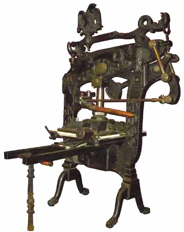
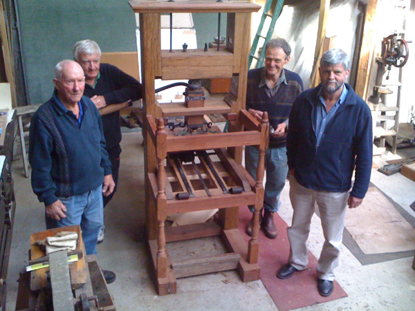
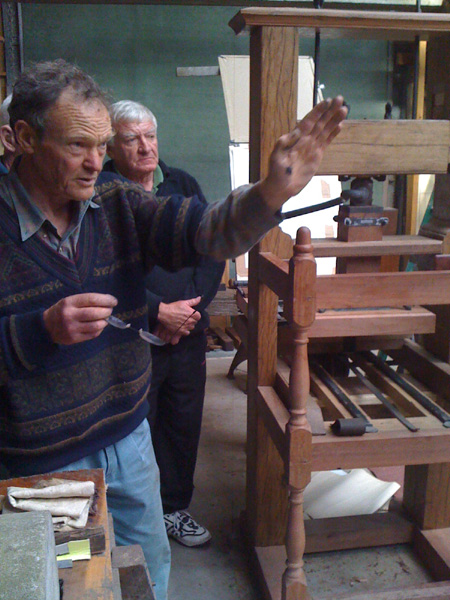
This is the Columbian press, the grand madam of the room. She's my press of choice from the three available to me, with her bobbing eagle counterweight and decorative dragons. I had a crash course in using her, including how to make my own brown-paper tympans and friskets.
The fact that I have to hand-roll the type, lower the frisket then the tympan, roll the bed under the platen and then pull the press handle for every. single. print. means that I am physically limited as to how intricate and/or layered these prints can be. I need to design them to be striking without being overly hard to produce.
I am also limited by the colours available to me. I can mix colours, but that means I also have to judge how much mixed ink I need for a print run, and the amount of ink varies according to how much surface area there is on the type; wood type is generally broad-surfaced and thirsty, whereas metal type is smaller and finer, needing finer layers of ink rolled with a lighter touch. When I first arrived, I only had blue, red, yellow, black and a transparent mixing white, but an ex-commercial printer who now works at the Uni of Otago library brought in a gift of some pristine tins of Pantone colours: a variety of reds (rhodamine, rubine, warm red, all fabulous and important distinctions when mixing colours), a green, orange and a good dense rich black that does not shade into grey like most offset blacks. A most welcome gift, and one I'm using gratefully.
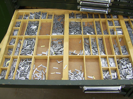
The other limitation, or maybe I should say, addition to the palette of choices, is the type itself. The Otakou press has a house font, Garamond, which is one I use extensively in my studio as well. So there is a healthy amount of that, plus a number of drawers of assorted fonts like Gill, Imprint Shadow, Plantin, Gothic Condensed, but not in any great quantity or variety of sizes. There is also a lot of very beautiful wood type, in many sizes (wood type is measured in 'lines' but I don't know what 'lines' actually means).
So, to print a poem as a poster, no matter what my idea is, I have to find a font that not only suits the feel of the poem, but also has enough characters in the drawer to set the whole poem and whatever I want to use around the page. I had to count every character in every poem and make a chart of the alphabet needs so that for each layout I can make sure that I can make the poem before I get halfway through and discover that there aren't enough Hs or something. And you know poets... they tend to use strings of words with the same letters, even if they aren't conscious that they're doing it (I don't even mean alliteration or rhyme... I mean just repetitions of letters generally).
My first attempt was a shape poem by NZ poet Sue Wootton, called No Strings Banjo. Donald thought that this would be one of the hardest poems to tackle, but actually, making a shape in letterpress is fairly easy if you stick to the basic principles of keeping all the lines the same length and making a shape within a block, like building pixels.

This turned into this:

Please excuse the torn base and the handwriting; this was my bon-a-tirer (good to print) reference copy for editioning purposes.
I didn't know that Sue was from Dunedin until she walked into the studio for a peek, and to my delight she was delighted with the layout, and adored the Fancy Western wood type as much as I do.
I wasted a lot of paper on that first edition, until I worked out my rolling technique. Donald forgave me, as he knew I'd been chucked in at the deep end. I thought the edition printed ok finally, but I know that by the time I get to the end of the residency, I'll look back at the quality of this first run and shudder.
The next batch, because I had such a clear picture in my head of the print, was Les Murray's At the Opera. Donald wanted COLOUR, and so I decided to give him some red, a good patchy red velvet curtain of a large wooden M.

Like this one, all rolled up and ready to print as this:

Another thing that Otakou Press has in abundance are wonderful vintage image blocks, ranging from whimsical Victoriana through to cheesy ads from the 70s and 80s, before everything moved to polymer plate. Donald wondered if I might not use a couple, like this one:

He thought it might be a good way to illustrate the word lorgnette, which is the central premise of the poem, but I decided to keep everything typographical, to stay away from the ready-made images, and make people do what I suspect Les Murray wanted people to do: go and look up the word.

Now
So I'm beavering away, even on the weekends, because doing something every day is the only way I'll get everything done. I've had lots of visitors, including a bunch of wonderful librarians who have been helping me tear down the paper. Part of my brief was to promote the program locally, so I've had interviews with the local paper, the university paper and there's one coming up with the local tv station. I've talked to English students about working visually with poetry from a textual viewpoint, and to printmaking students about working with text as image and markmaking with moveable type.

I'm discovering how fast I can work if I only have one roller, and one colour, but that working fast gives me blisters. I printed 130 pages (I allow for bad printing!) in two and a half hours on Sunday to produce an under-layer for my Vincent O'Sullivan poem layout:

It's a poem about rocks in a river forming trains like bridal veils, so I've printed large pine type that has a distinct wood grain in a green-grey, and will make the three stanzas of the poem into charcoal-silver clumps that will have cool watery type trails.
While that layer dries, I'm working on the Stephen Edgar poem, a fabulous piece about imagining words in the air around oneself. While my inner vision is an airy one in dull colours, what has emerged from the type and colour resources (and Donald's yearning for colour) is quite different. It's early days yet, but I've pulled from the poem the notion of sunset revealing disintegrating words, so I'm using sunset colours of pinky-red and orange and black...

This is hot off the press this afternoon, my first tentative pull in one colour to see if the composition works. I'll be running this one through the press twice, like the O'Sullivan, which will cut into my time a bit. I can see the next two weeks being completely manic as I try to get everything printed in time for the folios to be collated by the last week. I've just finished talking to the most excellent university binder here about the folio design of black & white with a strip of overprinted proof inset into the front. Yum!
I have been blogging my Dunedin experiences, both printing and otherwise, at my personal blog, and there are more photos on my flickr page.

(BTW, If you're interested in purchasing Prime, you can contact Donald by emailing donald[dot]kerr[at]otago[dot]ac[dot]nz. Because the press is not-for-profit, they retail the PIR produce at very affordable prices, and pump all the money back into the residency. This folio of seven posters will be only NZ$250 plus postage and packing. We've already sold a third of the edition, so don't delay if you want one.)
Cross-posted at Ampersand Duck.

The residency fell into my lap, through the generosity of master printer Alan Loney, who took it upon himself to introduce me to Donald Kerr, the Otago University Special Collections Librarian, when we were all at a conference in Brisbane called The Limits of the Book. Donald has custodianship of a wonderful collection of printing equipment, originally established as a bibliography teaching aid, and while continuing to be used as such, has also become a press in its own right: the Otakou Press. Established in 2003, it hosts an annual short-term printer in residence who produces a work that is sold – and usually sold out before the project is finished – and funds the next PIR the next year. The residency is now totally self-funded, and includes travel, accommodation (which includes food) and a stipend.
Donald and I had wonderful talks in Brisbane, about letterpress, the history of the equipment, and his liking of posters. Up to now all the printers had been New Zealanders, men, and had made books. Time for a change! We decided that I would be the 2010 PIR, and we would make posters, preferably using some of the wood type in the collection, which had scarcely been utilised.
We decided to have six poets, three from NZ and three from Australia. Donald picked out some names and emailed them all to see if they were amenable. Peter Porter and Les Murray were on his list, but PP died soon after, and we didn't hear from Les, so we ended up with Vincent O'Sullivan, Michael Harlow and Sue Wootton batting on the NZ side, and Robert Adamson, Sarah Holland-Batt and Stephen Edgar for the Aussie side.
And then Donald got a letter in the post from Les, who doesn't do computers. He'd LOVE to be in it. And, we both agreed, you can't say no to Les. So. We had SEVEN poets, and I just didn't have the time in the residency to add an extra NZer – seven was going to be pushing it. Did I mention that my edition is to be 100 of each, plus title page and colophon? That's 900 pages, over a period of six weeks.
There was only so much planning I could do beforehand, since I hadn't seen the type selection: read the poems (each poet sent a small selection of small, in most cases unpublished, poems to choose from) and select one for each, and make notes about what each inspired visually when I read them. We'd decided upon paper stock, and ordered it: Fabriano Rosapina, a lovely thick white Italian paper, that would need to be hand-torn into quarter-sheets.

The poems I picked didn't seem to have any connecting theme, apart from my liking them, so I decided to go with the idea that their number inspired and call the folio PRIME, playing with the idea of seven as a prime number and also that these are poets in their prime. Since then I have realised that the connection is one of process (in the use of wood type) and that the title could have reflected that, but I'm happy with Prime.
Then
Arriving at the University of Otago, settling in to my digs at the very comfy St Margaret's College, and getting to know my way around were all the easy things to do at the start of my residency. Dunedin is beautiful, even in the depth of winter, and surprisingly warmer than Canberra, owing to what everyone says is a mild winter. The big learning curve was tackling the presses in the print room...
I am used to printing with a cylinder flatbed letterpress, which has built-in rollers that ink the type and can be adjusted to stay at a level that rolls the type the same way every time. Here in Dunedin, they have iron hand-presses only, which means that the printer has to hand-roll the ink onto the type every time they pull a print.
The up side of that is that you can print multiple colours at once. The down side is that you have to develop a good technique of rolling sensitively to the type's needs, and evenly, and neatly. Every time. And I had to learn how to do it FAST, because there were those 900 pages to print, and time was ticking.
I'm talking in the past tense here, but as I write I'm still in the thick of it. I'm nearly halfway through my third week of the residency, and I'm only 300 pages in...
This is the Columbian press, the grand madam of the room. She's my press of choice from the three available to me, with her bobbing eagle counterweight and decorative dragons. I had a crash course in using her, including how to make my own brown-paper tympans and friskets.
The fact that I have to hand-roll the type, lower the frisket then the tympan, roll the bed under the platen and then pull the press handle for every. single. print. means that I am physically limited as to how intricate and/or layered these prints can be. I need to design them to be striking without being overly hard to produce.
I am also limited by the colours available to me. I can mix colours, but that means I also have to judge how much mixed ink I need for a print run, and the amount of ink varies according to how much surface area there is on the type; wood type is generally broad-surfaced and thirsty, whereas metal type is smaller and finer, needing finer layers of ink rolled with a lighter touch. When I first arrived, I only had blue, red, yellow, black and a transparent mixing white, but an ex-commercial printer who now works at the Uni of Otago library brought in a gift of some pristine tins of Pantone colours: a variety of reds (rhodamine, rubine, warm red, all fabulous and important distinctions when mixing colours), a green, orange and a good dense rich black that does not shade into grey like most offset blacks. A most welcome gift, and one I'm using gratefully.
The other limitation, or maybe I should say, addition to the palette of choices, is the type itself. The Otakou press has a house font, Garamond, which is one I use extensively in my studio as well. So there is a healthy amount of that, plus a number of drawers of assorted fonts like Gill, Imprint Shadow, Plantin, Gothic Condensed, but not in any great quantity or variety of sizes. There is also a lot of very beautiful wood type, in many sizes (wood type is measured in 'lines' but I don't know what 'lines' actually means).
So, to print a poem as a poster, no matter what my idea is, I have to find a font that not only suits the feel of the poem, but also has enough characters in the drawer to set the whole poem and whatever I want to use around the page. I had to count every character in every poem and make a chart of the alphabet needs so that for each layout I can make sure that I can make the poem before I get halfway through and discover that there aren't enough Hs or something. And you know poets... they tend to use strings of words with the same letters, even if they aren't conscious that they're doing it (I don't even mean alliteration or rhyme... I mean just repetitions of letters generally).
My first attempt was a shape poem by NZ poet Sue Wootton, called No Strings Banjo. Donald thought that this would be one of the hardest poems to tackle, but actually, making a shape in letterpress is fairly easy if you stick to the basic principles of keeping all the lines the same length and making a shape within a block, like building pixels.
This turned into this:
Please excuse the torn base and the handwriting; this was my bon-a-tirer (good to print) reference copy for editioning purposes.
I didn't know that Sue was from Dunedin until she walked into the studio for a peek, and to my delight she was delighted with the layout, and adored the Fancy Western wood type as much as I do.
I wasted a lot of paper on that first edition, until I worked out my rolling technique. Donald forgave me, as he knew I'd been chucked in at the deep end. I thought the edition printed ok finally, but I know that by the time I get to the end of the residency, I'll look back at the quality of this first run and shudder.
The next batch, because I had such a clear picture in my head of the print, was Les Murray's At the Opera. Donald wanted COLOUR, and so I decided to give him some red, a good patchy red velvet curtain of a large wooden M.

Like this one, all rolled up and ready to print as this:

Another thing that Otakou Press has in abundance are wonderful vintage image blocks, ranging from whimsical Victoriana through to cheesy ads from the 70s and 80s, before everything moved to polymer plate. Donald wondered if I might not use a couple, like this one:

He thought it might be a good way to illustrate the word lorgnette, which is the central premise of the poem, but I decided to keep everything typographical, to stay away from the ready-made images, and make people do what I suspect Les Murray wanted people to do: go and look up the word.

Now
So I'm beavering away, even on the weekends, because doing something every day is the only way I'll get everything done. I've had lots of visitors, including a bunch of wonderful librarians who have been helping me tear down the paper. Part of my brief was to promote the program locally, so I've had interviews with the local paper, the university paper and there's one coming up with the local tv station. I've talked to English students about working visually with poetry from a textual viewpoint, and to printmaking students about working with text as image and markmaking with moveable type.

I'm discovering how fast I can work if I only have one roller, and one colour, but that working fast gives me blisters. I printed 130 pages (I allow for bad printing!) in two and a half hours on Sunday to produce an under-layer for my Vincent O'Sullivan poem layout:
It's a poem about rocks in a river forming trains like bridal veils, so I've printed large pine type that has a distinct wood grain in a green-grey, and will make the three stanzas of the poem into charcoal-silver clumps that will have cool watery type trails.
While that layer dries, I'm working on the Stephen Edgar poem, a fabulous piece about imagining words in the air around oneself. While my inner vision is an airy one in dull colours, what has emerged from the type and colour resources (and Donald's yearning for colour) is quite different. It's early days yet, but I've pulled from the poem the notion of sunset revealing disintegrating words, so I'm using sunset colours of pinky-red and orange and black...
This is hot off the press this afternoon, my first tentative pull in one colour to see if the composition works. I'll be running this one through the press twice, like the O'Sullivan, which will cut into my time a bit. I can see the next two weeks being completely manic as I try to get everything printed in time for the folios to be collated by the last week. I've just finished talking to the most excellent university binder here about the folio design of black & white with a strip of overprinted proof inset into the front. Yum!
I have been blogging my Dunedin experiences, both printing and otherwise, at my personal blog, and there are more photos on my flickr page.
(BTW, If you're interested in purchasing Prime, you can contact Donald by emailing donald[dot]kerr[at]otago[dot]ac[dot]nz. Because the press is not-for-profit, they retail the PIR produce at very affordable prices, and pump all the money back into the residency. This folio of seven posters will be only NZ$250 plus postage and packing. We've already sold a third of the edition, so don't delay if you want one.)
Cross-posted at Ampersand Duck.
Labels: broadsides, letterpress, making, poetry, process, typesetting
posted by Ampersand Duck at 7:23 am
0 comments